Tuesday, April 11, 2017

Dining room update! The walls have been painted in this beautiful rich hue and the ceiling has been glossed for the high shine finish. I selected the lightest grey for all the millwork. Going to hang the chandelier next and fill the space! Can't wait to share!
                                                            
~Michelle

Friday, March 31, 2017

The budget friendly dining room make over has begun! Furnishings have been cleared out, floors protected, chair rail removed, walls smoothed and prepped for success! Soon the painters will be here to give the ceiling a brilliant coat of glossy paint in the most beautiful sea glass color. I'm as excited as my client, it can't come soon enough!
In the meantime, we will attend to a pair of Louis chairs and make them our own. Dry brushing metallic paint in pewter gives the chairs exactly the sapphire appearance that I'm looking for. Sometimes paints read differently than their names suggest. This is one of those times...lucky for us!
Before
 After
Bye-bye beige!
Can't wait to see these chairs after they've been reupholstered in this beautiful "Minx" fabric by Meredith Heron for JF Fabrics. Once done, I'll share the other fabric chosen for the back. Always fun to do something a little unexpected.

~ Michelle

Wednesday, March 22, 2017

Dining Room Update...Time for textiles!

You might be asking yourself, "where did you start?" In this case it was the beautiful large print that caught my attention and wouldn't let go! Immediately I identified it as the face fabric (#2) for the captains chairs. Always looking for opportunities to use dual fabrics for upholstery, I went with a solid navy (#1) on the reverse side for a little regalia.
Guilty, I can't get enough of this beautiful metallic grass cloth (#3) with a hint of rose gold! Literally the jewelry for the walls, it will be on the focal wall behind a French grey metal sideboard. Since we are talking glitter, lets spread it around with (#5) gold thread metallic for drapery panels. They will be banded in raspberry and separated by linen, barely raspberry roman shade.

Our fret work chairs (seats) will be reupholstered in (#7) chenille, a pair on each side of the table. Both pairs will be separated by a single Louis chair done in this beautiful (#6) Leopard for a face fabric. On the reverse side more of the beautiful (#2) traditional larger scale print. Finally, I'm still thinking of all the ways I can use the studded (#4) tape, I don't want to give it all away yet.

My goal for this project was to truly blend the old with the new in a collected but fresh way. Mixing high and low materials giving the clients what they desire within a budget they can afford.

I can hardly wait to see all these pieces come back from the upholsterer! BTW - I'm still on the hunt for a rug, the original rug blew the budget, so back to the drawing board on that one. I'll keep you posted...no pun intended...well maybe just a little.

~Michelle

Wednesday, March 15, 2017

Master bedroom update! The grass cloth is up and it is even more gorgeous in person! The shimmering rose metallic wallcovering speaks to luxury and elegance.
Upon entering the space, neutral walls stand silent as your eyes are drawn to the ceiling and glistening wallcovering. Plum/grey paint connects the clients existing grey furnishings to the space and textiles. Making the ceiling a highlight is always a fun challenge, so I committed to a saturated color that would give this room its own personality. 

Now we are just waiting for custom window dressings and bedding. In the meantime, I'm choosing the final dual fabrics for a super comfy bedroom chair! See you soon!

~Michelle

Saturday, March 11, 2017

Flooring is the foundation that can make or break a space. Similar to the idea, "The shoes complete the look." The same is true of a well designed interior. Anchoring your design with the appropriate flooring will help to achieve a cohesive environment.

BEFORE
Currently their is white oak at our 1930's project. I love white oak but not in this golden stain. It's beautiful with a clear coat for contemporary spaces, however the clients want a deeper more saturated look for their home.
Sanded white oak above. Notice the fireplace has been completed!
My go to stain is English Chestnut. I use it 95% of the time because of its warm rich finish. Here it is without the Polyurethane. Already you can see how much warmer the space feels. Our jewels tones will work beautifully with the space.
It's not in the budget to address the kitchen yet, however the kitchen floor was in really tough shape. Besides the mixed materials, the flooring in front of the sink was water damaged and had developed and unpleasant odor. Instead of spending dollars on a band aide like linoleum, I suggested they commit to the wood floor now and weave in new flooring near the cabinetry at a later time. In addition, it will make the daily living experience a much more pleasant once their living in the home.   
Layers of flooring were removed.
New flooring has been installed and stained in the kitchen. Immediate improvement!

AFTER
Semi-glossed and ready for paint! See you next time. Pop in for the next update!

Thursday, March 9, 2017

The master bedroom is one of the most common oversights. More often than not it is the last room to be addressed in the home. We all need a space not only to sleep but to recharge, reflect or just be. Your bedroom should feel like a place you can escape to at the end of the day. Ask yourself, does your bedroom provide a nurturing environment that you enjoy? If not, what does it need to welcome you at the end of a long day?

Everyone has different scenario's of what a restful haven means to them. These particular clients wanted a soft visual for their master that reads calm, quiet and elegant.

BEFORE
The headboard, dressers and carpet were purchased by the clients prior to them asking for me for assistance. Many times I have to marry the existing furnishings with new elements, it's part of the fun and always a puzzle regardless of who sources the products.
 My plan is to provide them with tonal fabrics and layered textures to keep the space calm without sacrificing on style.  
Adding a little character to the room in this case will come in the form of crown molding. The ceiling color will be a dreamy (soft lavender) visual before closing their eyes every night.
Luscious fabrics to see and feel for this master respite, proving a calm palette that is diverse in texture can be interesting and still make a design statement. Center stage, the metallic grass cloth wallcovering to be used on the headboard wall only. Can't wait to share the progress...more to come!

~Michelle

Monday, March 6, 2017

BUDGET FRIENDLY DINING ROOM MAKEOVER.

Over the years this dining room has been lovingly used for family gatherings, homework and scores of other needs. As time goes on, my friend and client decided that it was time to bring back the main focus of this dining room. A fresh new space for their family to share meals and entertain.

BEFORE
 The first thing I noticed was a nice size room that just needed a few key things to achieve a new look. An initial suggestion I made was to increase the ceiling height visually by eliminating the chair rail. Currently it is breaking up the walls and making the room feel stunted. The removal will elongate the walls resulting in simple elegance.
In picking the palette for this room, I chose a combination of neutrals with navy and plum accents. The only exception being the ceiling, a robins egg blue is in plan. In making my choices, I had to take into account the rest of the home and avoid creating a disconnect.

After some thought, I decided that the ceiling would be a major star of this dining room. Not so much for the depth of color (because you know 95% of the ceilings I do are never white) but for the shine. Luxurious because of its high gloss sparkle and reflective qualities. As crazy as it sounds, it will give the space a high-end look immediately. The cost of this particular paint is on the higher side but it's worth it!
We can use "Fine Paints Of Europe" on our ceiling because we found captains chairs at outlet prices and are having them reupholstered. There were only two mismatched chairs left. The pair will grace opposite ends of a trestle dining table. .
    Loved these for the shape and leg finish. Hard to see here but slightly charcoal metallic.
 The find of the day! Four amazing fret work side chairs! The wood will be refinished and the seats reupholstered in a family friendly fabric to resist stains.
 Say hello to the ceiling color! The only difference other than what you see here will be its glass finish. Never ignore a ceiling, it's an opportunity to make the fifth wall extraordinary.
Every room needs jewelry! Here's ours! Cheers to a great consignment find for less than $300.00 and the perfect compliment for our beautiful ceiling. Oh...I forgot to mention that there is medallion on the ceiling that my clients husband made. Gorgeous plaster work is his trade....hmmm what else can we have him whip up for us?

~Michelle

Wednesday, March 1, 2017

Consignment junkie? Me too! If your patient and love a bargain on quality home décor, it's not impossible to find beautiful things that don't hurt your budget. This punch of rug color would make any room sing! The teal bench is the perfect color compliment. Throw a few warm wood pieces in and you could give a sad room new life!
ON THE FLIP SIDE
Spring is just around the corner. Edit! Edit! Edit! Clear out the stuff that serves no purpose. You know the rule: If you haven't any use for something, let it go! You can call Fiddleheads Consignment or your local consignment shop to send off your purge and earn more money to splurge! Donating to a charitable organization is another option. Either way, gear up for spring cleaning and switch it up a bit to generate new energy in your home.

~ Michelle


Thursday, February 23, 2017

Fireplace Repair

Purchasing an older home can be filled with romantic ideas of entertaining family, friends and late night dinner parties or soirees. The reality...it may take a little work before those dreams come to fruition if the home wasn't previously updated.

In this case, the previous owners promised to repair the fireplace as part of the sale agreement. The last thing you want is a carbon monoxide issue or a fire hazard, so the interior box and damper had to be repaired resulting in a decreased opening by 4" on all three sides. In this case, smaller means safer.
Before
Hearth tiles were removed to make way for new tiles. A new interior has been installed and painted so the box looks like it's always been there.
FYI - I normally add 10% waste on top of what the tile project calls for if I'm not doing a custom cut stone for the surround. 

A little more sanding of the thinset mortar to prepare the surround, then the and hearth will be ready for tile!
A must see in person! This tile is now one of my favorites!
Here's our tile installed. Floors next!  

~Michelle

Tuesday, February 7, 2017

New beginnings for a 1930's home

Earlier in the year a lovely home was purchased by a client in the Greater Boston Area of Braintree, Massachusetts...a suburb south of Boston Proper. Here are a few facts about Braintree if your not familiar. The town was settled in 1625 and has a great lineage of history. Most notably, it is the birthplace of two past Presidents, John Adams and John Quincy Adams. Brevet Brigadier General Sylvanus Thayer was also from Braintree and the Father of the United States Military Academy at West Point. A few great reasons to live in Braintree.

Although not as old, this home possesses some really great characteristics and charm of Braintree in the 1930's. It has great curb appeal and feels like an era gone by as you enter the home, but before you do, the front entry welcomes you in with a triple arched porch! How lovely is this? I see so many possibilities!

Before pictures of our current project.
I love a corner lot and the many mature trees surrounding this home.
Looking forward to improving on the walkway and landscaping at some point.
The side entry and it's arched door is especially lovely. This door is right off the kitchen. I have great plans for this little spot...Big things can come in small packages as they say. It's going to be filled with many textures and global flair!
 The kitchen needs a lot of love. A luxury kitchen is not in the budget at the moment, however we are going to spruce it up in the meantime and make it feel like home.
Great original paneling dress the walls of the dining room!
The color and textile possibilities are endless.
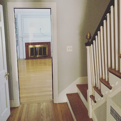
A clear visual all the way through from the side door. I'm imagining beautiful paper in the hallway and jewel tones in the living room. While we're at it, let's give the fireplace a new lease on life, with a new surround and screen.
 Original French doors!
The previous owners viewed their television over the fireplace. We are going to relocate it to this area and mount it on the wall out of view. I would like to see the fireplace become a focal point again.
The design concepts are in place and now I'm just wrapping up the details. Next time I'll share what's going on in other areas in the house. This should be great fun! I hope you follow along for the ride! Thanks for stopping by!

Friday, February 3, 2017

Hello friends! It has been a long while since I've shared from this writing place. Last year was a world wind and with so much going on it was hard to find time to stay in touch. Projects took me to Brooklyn, Pennsylvania, Plymouth Ma. and locally from residential to commercial. In addition we had two weddings in the family, topped off with a little traveling. So yes, a very busy year.

Here are a few images from 2016 just for the sake of catching up. These projects have not been visited for photography but will be by spring for a complete visual story. Just a peek for now so you can see what been keeping me away.

Three ladies And A Condo
A stunning Queen Anne chair I found at Fiddleheads Consignment. I actually liked the original yellow, however it would not have worked in the clients new color palette. It was hard to part with this one. Chairs are my weakness and I grew to love this one.
Stripping it down to make way for an entirely new look. Gold and navy for a sophisticated and timeless look. SHE is the head of the family, so her chair should look important, don't you think?
Here is the finished product in Meredith Heron's fabric. I love it and thankfully so does the client!
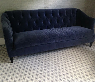
She gets a new tufted sofa, and grass cloth is repeated on this side of the room.
This rug is so beautiful in person. It was customized for the space so that the furnishings would all fit properly on the rug. The look repeats the tufting in the sofa. I requested it be cut on a soft curve for a gently blend as it crosses over into the dining area. The edges are beautifully surged for a clean but handwoven look.
The plush navy sofa filled the cozy niche so nicely, it just needed
a few custom pillows to add a bit of energy.  
 Custom Dunes and Duchess table. Gorgeous!
Thibaut grass cloth wall covering added to the newly installed paneling. The paneling helps to add interest to this long visual expanse.
Up close and personal,this color is truer to the actual paper. Panels and grass cloth dress up this dining space. Adding clarity to the rooms scale, while defining the dining area in this open floor plan. 
 Across from the cozy nook, a Dunes and Duchess custom table anchors the room. It's flanked by two rows of dotted grey on crème Louis chairs, while fuchsia boucle captain chairs make a statement at each end. The floors in this space are charcoal stained maple. The stain is repeated on the tabletop.

 Crystal leaves dangle from the bronze branches above the table. Coordinating sconces flank the center panel.
Unwrapping this beauty wore me out!!! Yup, that's me...all worn out!
 Worth it! The lighting over the kitchenette table is not predictable! A roman shade in animal print create a nice canvas for the delicate lighting. Organic and luxe all at the same time.


The Church
Before
After
Saint John's church after with added new draperies and rugs. A much needed refresher after 20 years.


The Bank
The gentleman's room is all I can share for now. More to come...


Quincy Ocean Side Home
A peek at one of the bathrooms.
This custom home was all about the details. More to come....


The Plymouth Oceanside Home
The master bathroom shower is a combination of Bardiglio and Carrera marble. A free standing tub is centered on a window overlooking the ocean. Can't wait to share!


The Brooklyn Apartment
Sit back and relax. A cozy urban apartment near the Verrazano Bridge designed for a single lady.
Marbleized fabric flank the windows in the living area.  
Beautiful bedding from Anthroplogie complete the look for this Parisian look in Brooklyn.  
Kitchen lighting meant for a "Pied A Terre." This kitchen is open to the living area so it had to rise up to the rest of the space. No matter where you are in this space, it has a strong feminine vibe.   
A West Elm "Waterfall" chandelier hangs in the center of the living space. Feels like 1940.


The Consignment Chairs redone
Feel in love with this pair, even though they were in apricot!! That color hurts my eyes so I'm showing you in black and white:)
Reupholstering was the next step using two different fabrics. One to invite you to sit and one to envelope you once your in. This beauty is dressed in a tone one tone combination in a grey/lilac Crypton fabric. It resist stains but is soft to the touch and luxurious.
Flowers always take a space to the next level.


The Plymouth Lakeside Home
A family bought this originally 30 years ago as a summer home retreat. However now that the children are all grown up, some with children of their own, it was time to increase the living space. This sweet little cottage was torn down to make way for a larger gathering space on the lake.
After
The result, a beautiful lakeside home with a vast team contributing to the outcome.
Bathroom tile and cabinet materials.
I love working with Rooms Scapes. The result is always fantastic! More images to come when it's completely done.


The Wedding
My son was wed and the day was divine. It was and amazing year!


Here are a few things coming up in 2017... 1930's home being completely made over. A spa haven that would never make you want to leave your home. Large renovation for a growing family. Master bedroom that makes you forget where you are.

Coming up next...
The 1930's Home Makeover

See you soon! Thanks for stopping by!